No middleman.
No mark-ups.
No BS. JUST BG.
FAQ
- What is screen printing?
- What is spot-color?
- What is 4-color process?
- What are half tones?
- What is line count, screen frequency, and lpi?
- What is screen count or mesh count?
- What is an underbase?
- What is flashing or flash drying/curing?
- How many colors can you print?
- What kinds of artwork can be used for screenprinting?
- What do you charge for a custom logo?
- How should I send you artwork or logos?
- What file types can I send you?
- What's the difference between vector and bitmap files?
- Do you use Mac or Windows computers?
- Can you match an exact PMS color?
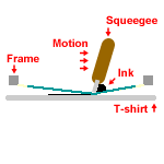
Q: What is screen printing? A:
Screen printing is a process though which ink is mechanically applied to a substrate via the use of a screen and squeegee. In it's basic form, screen printing is a very simple process.
First we start with the artwork. Each color of the design requires an individual screen so we must separate the design into its component colors. This is done on the computer and each color separation is printed to a transparent sheet.
| Original | Black | Green | |
| Design Colors |
|
|
|
| Separations |
|
|
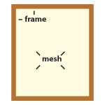
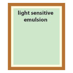
Next we must prepare the screens. The screen is a rigid frame of wood or aluminum that has a fine monofilament nylon mesh stretched over it. This mesh is then coated with a light sensitive emulsion that will become the stencil through which the ink will pass when printed.
 |
|
| Blank Screen | Coated Screen |
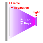
The screen is then mounted, with the separation, in an exposure unit. This machine exposes the screen to high intensity UV light.
 |
| Exposing the Screen |
When the UV light hits the emulsion a chemical reaction hardens the emulsion making it water and solvent resistant. The separation acts as a shield to block the light in certain areas of the screen. These soft areas are then rinsed away with water to create the open area of the stencil.
 |

|
| Black Screen | Green Screen |
The screens are then mounted in the press and registered,or aligned, so that each color prints in the proper location relative to the other colors. Ink is loaded into the screens and squeegees are installed. The actual printing is accomplished by pushing ink through the screen and onto the shirt with the squeegees. As the squeegee scrapes across the screen it fills the stencil with ink while simultaneously bending the mesh down to transfer the ink to the shirt.
To create the composite image on the shirt, individual colors are printed then the shirt is moved to the next color. After test prints are run to check alignment, shirts are loaded one by one and printed.
 |
|
| Printing Mechanics | Colors Print In Sequence |
Once all the colors have been applied to the shirt it is removed from the press. The ink on the shirts is still "wet" at this point and needs to be "dried".
The ink we use for t-shirts is the variety called "Plastisol" and is not actually"dried" but cured with heat. Plastisol is made up of polyvinyl chloride resins (PVC), plasticizer and pigments. When plastisol ink is heated the PVC resin particles swell and absorb the liquid plasticizer and these swelled particles merge with each other and form a solid film. Curing of plastisol ink is accomplished by rapidly bringing the ink up to curing temperature ( ~330° F ) with electric or gas infrared heaters.
To cure the shirts we run them through a "drier" that utilizes a conveyor belt to pass the shirts under infrared heating panels. The shirts spend between 30 seconds to 1 minute in the dryer, and when they come off the belt they are done and ready to be folded and packed.
[Back To Top]
Q: What is spot-color? A:
Spot-Color is the term used to describe separation and printing with one ink color for every color in the design. Each color that makes up the composite image will be printed using a separate screen.
Example: "Spot" Color Design - 2 solid colors
| Original | Black | Green | |
| Design Colors |
|
|
|
| Separations |
|
|
A slightly more advanced type of spot-color uses halftones to create the appearance of a gradient using small dots of the solid ink colors.
Example: "Spot" Color Design - 1 solid color + gradient
| Original | Black | Green | |
| Design Colors |

|

|

|
| Separations |
|

|
This technique can be taken a step farther to combine two gradient screens and produce the appearance of more colors then are actually being printed. The small dots being printed so close together trick the eye into seeing the color they make when mixed.
Example: "Spot" Color Design - 1 solid color + 2 gradients
| Original | Black | Green | Brown | |
| Design Colors |

|
|
|

|
| Separations |
|
|

|
[Back To Top]
Q: What is 4-color process? A:
4-color process is a more advanced separation and printing technique that uses 4 colors of transparent ink to produce the colors from the original design. The four colors, Cyan, Magenta, Yellow, and blacK ( CMYK ), are printed as halftones that interact with each other and the white background of the shirt to create color and tonal values. A wide spectrum of colors can be represented but some colors are impossible to produce.
4-color process is used mostly for photographic or digitally created designs because many shades and colors can be created with only four screens. High screen counts and screen frequencies are required to create the tiny halftone dots.
One drawback to 4-color process is that the garment must be white.
4-color Process
| Original | Cyan | Magenta | Yellow | Black | |
| Design Colors |
|
|
|
|
|
| Separations |
|
|
|
|
|
| As Each Color is Printed |
|
|
|
|
 |
| Close-up of halftones |
[Back To Top]
Q: What are halftones? A:
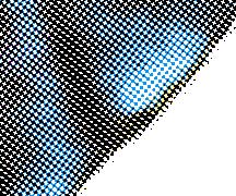
Halftones are a pattern of tiny dots that can simulate different shades of color using varing percentages of a single ink. Visually, halftones create the illusion of a continuous tone image by using spots of varying size and density to represent darker or lighter color values.
Halftones work by fooling the eye into seeing the combination of the ink color and the color of the shirt they are printed on. When seen from a distance, the colors blend together and the dots merge with the background color of the shirt. If you look closely at or magnify the print, the separate dots are quite clear. You can see good examples of halftones if you magnify a picture in a magazine or a print from a color printer or even if you look closely at your TV screen. All these are made up of tiny dots.
In screen printing we use halftones for three main purposes:
1. To create a tint or lighter shade of a color. This will allow more "colors" in the design without adding more screens.
Example:
| 100% Green | 50% Green | 20% Green | |
| Desired Colors |

|

|

|
| Halftones |

|

|
|
| Enlarged Halftones |

|

|

|

|

|
| One color image | Halftones | Enlarged |
2. To create a gradient or the appearance of a continuous tone of color:
Example:

|

|

|
| 1 Color Gradient | Halftones | Enlarged Halftones |
3. To create overlapping screens of different ink colors that combine to simulate more colors.
Example:

|

|

|
| Simulated Solid Color | Halftones | Enlarged Halftones |

|

|

|
| 2 Color Gradient | Halftones | Enlarged Halftones |

|

|

|
| 4-color process | Halftones | Enlarged Halftones |
[Back To Top]
Q: What is line count, screen frequency, and lpi? A:
These terms all refer to the number of vertical lines of halftone spots per inch or lines per inch (lpi). Halftones are created using a grid of cells. Each cell contains one halftone spot. These spots vary in size depending on the shade of color being represented but only one fits in a cell. The size of these cells determines the lpi.
| Individual Cell | Cell Grid ~3 lpi | Cell Grid ~12 lpi | |
| 10% Halftone |

|

|

|
| 50% Halftone |

|

|

|
| 90% Halftone |

|

|

|
Various lpi numbers are used for different types of printing. Magazine pictures may have 100-130 lpi, newsprint is typically 85 lpi, a 300 dpi laser printer is around 55 lpi, and billboards might be 3-6 lpi. When we are using halftones for screen printing we use 45 lpi for basic designs and 65 lpi for detailed and process type designs.
The correct lpi to use is a function of the detail you want to produce and the distance from which a print will be viewed. When reading a magazine, the 100 lpi halftones will be invisible at 12 ". Likewise, if you view a 45 lpi t-shirt print from 3-4 feet you won't notice the halftone dots.
[Back To Top]
Q: What is screen count or mesh count? A:
The mesh count is the number of threads per inch (tpi) used to weave the mesh. Typical mesh counts for screen printing t-shirts range from 85 tpi to 355 tpi. The mesh count defines basically two things: The thickness of the ink deposit and the size ( or lpi ) of halftones that can be printed.
The lower mesh counts, 85-110 tpi, have a relatively large thread diameter and more space between the threads ( called "open area" ). This allows for a thicker deposit and more ink to pass through the screen. Typically, lower mesh counts are used for specialty inks ( like glitter ) and when a thick deposit is needed on dark garments.
The high mesh counts, 305-355 tpi, have a very small thread diameter and less open area. These are used when fine detail and high halftone lpi are needed.
In the middle, 200-255 tpi, are general purpose screens for spot color, good detail and acceptable halftones.
[Back To Top]
Q: What is an underbase? A:
An underbase is a layer of ink, usually white, that is printed under the other ink colors when printing dark garments. When printing most colors on dark garments the color of the shirt will show through the ink slightly. For instance, yellow ink printed directly on a royal blue shirt will look very green. To prevent this, a thin layer of white ink is printed, then "flash" dried, and the yellow is printed on top. This gives the top colors a good neutral base and reduces or eliminates the shirt color showing through.
[Back To Top]
Q: What is flashing or flash drying/curing? A:
Flash curing is the process of "gelling" a layer of ink with a spot heating unit while still on the press. To "gel" the ink layer the temperature is raised to the point where the ink begins to dry but is not completely cured. The ink will be dry to the touch and will form a solid surface to print additional colors on. When the garment is run through the drier the flashed layer will cure completely and bond to the ink layers on top to form a solid film.
[Back To Top]
Q: How many colors can you print? A:
Strictly speaking, we can print nine to ten different ink colors at a time. However, we use several techniques to increase the number of perceived colors in a print. We can produce full color prints on both light and dark colored garments.
[Back To Top]
Q: What kinds of artwork can be used for screenprinting? A:
Almost any type of flat artwork "can" be used to create a screen printing design. Some good examples are: drawings, sketches, paintings, photos, digital files, logo slicks, even other t-shirts. Generally, if you can scan the image into the computer or redraw it by hand, we can use it.
It is very important that you start the design with a large and clear piece of artwork. For instance, it is impossible to create a 13" wide design directly from a logo on a business card. The small size does not provide enough information for the computer ( or human artist ) to enlarge the logo to the proper size and still look crisp and clear.
We would suggest the following guidelines:
| Logos |
|
| Sketches & Drawings |
|
| Photos |
|
| Digital Files |
|
And some pieces that shouldn't be considered usable:
- Business card size logos
- Letterhead
- Photocopies
- Anything from a newspaper or other poorly printed source
- Graphics from web sites
[Back To Top]
Q: What do you charge for a custom logo? A:
We do not charge for custom logo’s that we are going to print on t-shirts or other garments. However, per our polices, we retain all rights to the artwork we produce. If you would like limited reproduction rights (e.g. for fliers, a web site, entry forms, etc.) we grant that for free.
If you need concept design for your business or organization to use with full rights we charge $25-$75 per hour with a minimum of $300.
If you need complex color separations to be done before production, we charge $75/hour.
[Back To Top]
Q: How should I send you artwork or logos? A:
You can send us artwork via:
- Postal Mail
- UPS / Fed Ex
- Yousendit.com
For Digital Files we can accept Mac or PC format:
- Email attachments up to 10MB
- CD-R / CD-RW disks
- SD cards / Memory stick / most other portable memory cards
- Jump drive or other USB storage device
[Back To Top]
Q: What file types can I send you? A:
We have the following software and can accept any format that can be opened or imported by these programs:
- Adobe Illustrator
- Adobe Photoshop
We would prefer Illustrator .eps or .ai formats for vector files and .psd or .tiff for bitmaps.
Tips for vector files:
- VERY IMPORTANT: Convert all fonts in your design to curves or outlines.
- Bitmaps embedded in a vector file are still bitmaps and are hard to use for spot-color.
Tips for bitmaps:
- Resolution must be at least 300 dpi at the final printing size.
- Do not flatten images in case we need to edit the file.
- Bitmaps are best for designs printed in 4-color or halftones.
If you are not using one of the titles above, many other packages can save or export to the encapsulated postscript format (.eps) or .ai. If your software can only save in a proprietary format we will not be able to open your file.
[Back To Top]
Q: What's the difference between vector and bitmap files? A:
Vector graphics are made up of many individual objects. These objects are defined mathematically as a series of control points joined by lines or curves. Each object is self-contained, with properties such as color, shape, outline, size, and position on the screen. As an example, to draw a red square with a black outline, the software only has to know the position of the 4 corner control points, draw black lines between them, then fill the enclosed space with red. Since each object is self-contained, you can move and change its properties over and over again while maintaining its original clarity and crispness. Vector-based drawings are also resolution independent. This means that they appear at the maximum resolution of the output device, such as your printer or monitor. The image will not loose its proportion or definition when it is scaled up or down.
Bitmap, or raster, graphics are actually a "pixel map" that describes how to display an image pixel by pixel on the screen. Bitmaps are very resolution dependent; meaning that if the image is stored at 300 dots per inch (dpi) then every square inch of the picture will have 300 dots or pixels. Each pixel needs color and shading information stored for it. This makes for very large files at high resolutions. Bitmaps also do not scale up very well. If the image starts out being 1"x1" and 72 dpi (common dpi for web graphics) and you need to enlarge it to 10"x10" it still only has 72 dots. Now you can see the individual pixels quite clearly and the image looks very jagged. The computer can compensate for this and guess where more dots are needed but the image will be blurry because the "guess" is not perfect.
Comparing a vector-based image with a bitmap image.
| Original | 2 x Zoom | 4 x Zoom | |
| Vector |

|

|

|
| Bitmap |
|

|

|
Remember that vector graphics are created as collections of objects and bitmap images are made of individual pixels arranged in patterns. Of the two formats, bitmap images are better for photographs because they tend to offer greater subtleties for shading and texture but require more memory and take longer to print. Vector images are best for drawings that need sharper lines, more detail, and easy modification. Vector images require far less memory and computing resources.
[Back To Top]
Q: Do you use Mac or Windows computers? A:
We use Windows and Apples.
[Back To Top]
Q: Can you match an exact PMS color? A:
We offer near perfect PMS color matching.
[Back To Top]
No events found